Tuesday, 22 April 2014


Sunday, 20 April 2014


Saturday, 19 April 2014
Saddef Anwar: Question 2- How effective is the combination of your main product and ancillary texts?
- We intended to construct a promotional package that effectively promoted our product as a quality product alongside the romantic-drama genre.
- As a result, it was vital that our products worked in conjunction with eachother, forming an effective promotional package.
 We initially decided to keep similar presentations of our lead protagonist alongside colour themes to suggest the link between all three products.
- we also used the same body language in each of the products, for example; our lead is seen having her hand near her face in all three products illustrating her reserved persona. Also the dominance of our lead protagonist in all three products suggests that the film has a narrative based around an event in her life, establishing her as the main character.

^ Magazine
< Trailer
Typography:
- Throughout all three products in our promotional package, we used the same font for the title. Choosing an appropriate font was quite challenging as we had to keep a simple font that also looked effective, hence why we did a lot of trial and error
- My chosen genre generically used quite simplistic fonts, however, we had to bare in mind that our product was for a younger audience, hence why we had to choose a font that not only had elements of simplicty, but also intrigued our audience.
- As a result I chose the first font as it had a sort of scratchy handrwiting look to it, which reinforced the school setting for our film.

Colour Schemes:

- Throughout all the products i ensured that I maintained the same colour scheme. Though it was quite difficult to show the sepia colour in the trailer, I decided to use the same textures and backgrounds that I used for the poster, as the background for the slates that went within the trailer
- These textures included: crumpled paper. cracks, grunge and two different layers of smoke
- The tone of sepia that I have used throughout my work is called Ffe4af
Genre:

- Our magazine cover explicitly conveyed the genre of either romance or drama according to our audience. This was mainly done via the use of the heading 'Spring Dramas....'.This meant that our film was easily recognisable in terms of genre from the poster.
- During my product research, I came across the poster of 'Black Swan' which also belongs to the drama genre. The poster conveyed the genre of drama via the crack on the protagonists face. I personally really liked it and tried to use a 'crack' effect to not only show the breaking down of characters, but also relationships. This turned out to be a really effective technique as it put forward the genre of drama really effectively and explicitly.


The clips within the montage showed the distress of our lead protagonist in the way she spoke and interacted with others, alongside the shots of her smoking.
- I thought it was important to convey the genre via our products as our audience can identify it as something that they want to watch and not get let down due to an assumption that the film belongs to a different genre which they favoured more.
Tagline:


- The poster contains the same tagline that is featured in the trailer
- This repetition was effective due to the wording which sounded quite dramatic which also made it quite memorable
- In the poster, I used a different font for the tagline as opposed to the one that I used for the magazine cover and trailer. This may have caused trouble for the audience when looking at the poster because though the tagline is smaller in font size on the poster, it is more bold and it is in capital letters which makes it stand out more. However, during the process of construction, the presentation of the tagline was quite difficult due to the dark layers and textures that I had used, which was why I chose a different font.
Friday, 18 April 2014
Wednesday, 5 March 2014
Monday, 3 March 2014
Sunday, 16 February 2014
Evaluation: Monaire Pillay-Question 1: In What Ways Does Your Media Product Use, Develop or Challenge Forms and Conventions of Real Media Products?
We chose for our product to be a drama -use
which would need to include…
Realistic events
Relatable characters
and emotional or psychological dilemmas
we were able to show this through the use of our main character played by hanah
we cast her as she was the age group and gender of our target audience therefore she’s becomes a relatable character
generic storyline- love is the main theme and conveys that our product is of the Drama genre as love is a common theme In drama films
we show her having emotional drama by smoking, being, aggressive and obsessive. – Therefore showing she’s going through an emotional dilemma
Music-use of piano is re-occurring instrument within drama trailers
Our product is a hybrid -develop
we used aspects of
Romance and Neo Noir
we use a type of love triangle-romance
there are sinister aspects about her
a modern character, with femme fetal-like qualities –e.g seductive- use of bright lighting and extreme close ups (trailer) soft background (magazine) and red lipstick (poster and all products) making her both antagonist and protagonist – Ambiguous
-Modern school setting and clothing
-British teenagers
-Multiracial cast
how it challenges –the drama genre ?
it deals with teenage obsession, in an extreme way we are able to see how her love life effects her mental stability which although is generic of dramas is an delicate issue
Real Media Products
Kathryn-Cruel Intentions Alice-Closer


Gale-Sin city Jennifer-Jennifer's BodyThe Bride-Kill Bill
we took the traditional protagonist or villain in the narrative and made her the main character with the exception of The Bride who like Hanah's character is obsessed with getting what she wants

added similar characteristics of the character in Blue Jasmine such as a breakdown to give her vulnerability
 lastly gave her a sightly seductive edge such as the lipstick and the slow dreamlike close ups like Alice in Closer who we see change from being innocent to a seductive woman who is both in control but vulnerable at the same time
we used sartorial codes such as the lipstick to make her have the characteristics of a modern femme fetale like the other character comparisons


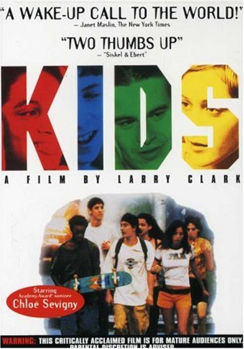
shaped our trailer off of films such as- Spring Breakers- Kids-Thirteen- Cruel Intentions-Blue JasmineKids- similarly to KIDS we have a multiracial teen cast in our trailer as well as setting it in a school. like kids we focus on issues within the teen community.
such as
-teen romance
-couples and relationships
-and everyday school life
Kids -set in the streets of America vs The Thin Line- set in a school in Britain
we chose to focus more on the relationship rather that the setting however the modern clothing makes our trailer seem like a modern British film
more like 4,3,2,1 that also focuses on problems of British female individuals (although less realistic)
Cruel intentions- centered around the issues around relationships as ours is with a seductive main character- rather than explicitly showing Hanah is suppose to be a seductive character (like Kathryn) we encode it for the audience to interpret
POSTER
for our poster we used character names title and credits to be generic.
As well as that, we used the cracks inspired from black swan, to suggest the breaking of their relationship as well as being suggesting of the title due to them being "thin lines"
We use characters looking directly at the audience, we decided to make them have no expression to show that they are not aware of what Hanah (the main character)is a sinister character.
we use a contrast of pastel tones as well as the use of beige, as it is commonly used in drama posters e.g the last song and April showers and a figure of a person to be symbolic. These are all generic features of Drama posters and we develop and challenge these forms through combining the idea of the cracking layers, with the idea of a poster featuring characters looking into the distance

 MAGAZINEWe
based the design of our magazine off of mainstream magazines such as Empire and
therefore tried to feature
MAGAZINEWe
based the design of our magazine off of mainstream magazines such as Empire and
therefore tried to feature
which would need to include…
Realistic events
Relatable characters
and emotional or psychological dilemmas
we were able to show this through the use of our main character played by hanah
we cast her as she was the age group and gender of our target audience therefore she’s becomes a relatable character
generic storyline- love is the main theme and conveys that our product is of the Drama genre as love is a common theme In drama films
we show her having emotional drama by smoking, being, aggressive and obsessive. – Therefore showing she’s going through an emotional dilemma
Music-use of piano is re-occurring instrument within drama trailers
Our product is a hybrid -develop
we used aspects of
Romance and Neo Noir
we use a type of love triangle-romance
there are sinister aspects about her
a modern character, with femme fetal-like qualities –e.g seductive- use of bright lighting and extreme close ups (trailer) soft background (magazine) and red lipstick (poster and all products) making her both antagonist and protagonist – Ambiguous
-Modern school setting and clothing
-British teenagers
-Multiracial cast
how it challenges –the drama genre ?
it deals with teenage obsession, in an extreme way we are able to see how her love life effects her mental stability which although is generic of dramas is an delicate issue
Real Media Products
Character comparisons include
Kathryn-Cruel Intentions Alice-Closer
Evie-Thirteen
Gale-Sin city Jennifer-Jennifer's BodyThe Bride-Kill Bill
we took the traditional protagonist or villain in the narrative and made her the main character with the exception of The Bride who like Hanah's character is obsessed with getting what she wants
added similar characteristics of the character in Blue Jasmine such as a breakdown to give her vulnerability
 lastly gave her a sightly seductive edge such as the lipstick and the slow dreamlike close ups like Alice in Closer who we see change from being innocent to a seductive woman who is both in control but vulnerable at the same time
we used sartorial codes such as the lipstick to make her have the characteristics of a modern femme fetale like the other character comparisons

shaped our trailer off of films such as- Spring Breakers- Kids-Thirteen- Cruel Intentions-Blue JasmineKids- similarly to KIDS we have a multiracial teen cast in our trailer as well as setting it in a school. like kids we focus on issues within the teen community.
such as
-teen romance
-couples and relationships
-and everyday school life
Kids -set in the streets of America vs The Thin Line- set in a school in Britain
we chose to focus more on the relationship rather that the setting however the modern clothing makes our trailer seem like a modern British film
more like 4,3,2,1 that also focuses on problems of British female individuals (although less realistic)
Cruel intentions- centered around the issues around relationships as ours is with a seductive main character- rather than explicitly showing Hanah is suppose to be a seductive character (like Kathryn) we encode it for the audience to interpret
POSTER
for our poster we used character names title and credits to be generic.
As well as that, we used the cracks inspired from black swan, to suggest the breaking of their relationship as well as being suggesting of the title due to them being "thin lines"
We use characters looking directly at the audience, we decided to make them have no expression to show that they are not aware of what Hanah (the main character)is a sinister character.
we use a contrast of pastel tones as well as the use of beige, as it is commonly used in drama posters e.g the last song and April showers and a figure of a person to be symbolic. These are all generic features of Drama posters and we develop and challenge these forms through combining the idea of the cracking layers, with the idea of a poster featuring characters looking into the distance
MAGAZINEWe
based the design of our magazine off of mainstream magazines such as Empire and
therefore tried to feature
•a distinctive title
design
•hyperbolic language

•eye-catching banners and puffs
• a photo of the cover
star as a central focus
We challenge the conventions of a film magazine as we attempt to target mainly women, we use this issue of screen as a "valentines day issue" as well using soft pastel colours to encourage a female audience
Through doing these things we where able to create a
distinctive identity for our
magazine as well as completing the
conventions required to make a film magazine.Then we where able to use things associate with the movie such as fonts and cover star to also convey the the promoted films identity.
Through making our main character seductive, by softening her
face and using a pallet of red we live
up to the conventions of a film magazine the target audience is predominantly male
We challenge the conventions of a film magazine as we attempt to target mainly women, we use this issue of screen as a "valentines day issue" as well using soft pastel colours to encourage a female audience
Saturday, 15 February 2014
Friday, 14 February 2014
Evaluation: Monaire Pillay-Question 3: What Have You Learned From Your Audience Feedback ?
TRAILER-
SCHOOL –applies to teen audience
-teen main character =relatable character
-theme of love applies to teenage girls (stereotypical)
-mainstream audiences
POSTER- Mature audiences because of the use of textures – makes it seem more like an adult aimed drama
MAGAZINE-a teen unisex audience
wanted to be conventional so we stuck with a basic plot line
-could not appeal to everyone had to go with the majority
-to make it appealing we added aspects they would enjoy, such as relatable character, setting and an interesting plot line
For our audience research what we did was
How old are you ?- 17-18-showed which age group we catering to. – target audience therefore we used a character cast as well as relatable situation and setting in order to not alienate the audience
Which gender do you belong too? Female mainly therefore we decided to use a female main character, which also makes it more relatable as well as romance being a stereotypical female ideal – we also cater to a male audience however don’t make it a priority- we do this because in a majority of film promotion, women are heavily sexualised therefore we sexualised Hanah in a subtle way
Which ethnicity do you belong to? Although we got mainly White British in the results, we chose to cater to a variety because of the variety of cultures which came up in our results as well as this our trailer is British, we felt as though it would be appropriate to represent the multi-faith society within British culture
What kind of drama do you prefer? In these results we got crime however chose to use the the second most popular result instead-romance. We chose this as we felt it would be much more relatable to a larger variety of female audience members as well as choosing to release a romance before Valentine’s Day, so that this would encourage couples to see the movie. Also we chose to add something sinister to our characters character in order to meet the demands of our target audience.
Have you ever watched a film from the drama genre? 80% said yes By knowing the level of genre popularity, we were able to know if we should choose another genre or continue with the genre that we had.
CLASS FEEDBACK

for our rough cut, our promotional package was given feedback from the class. after being given feedback we were able to change and improve our products based on this such as the colour scheme for the magazine. we changed the colour and the font of the titles due to members of the class saying that they "did not mesh well" as well as it being "too feminine" we decided to change the magazines colour pallet to a dark red and therefore making our magazine look more like a generic film magazine rather than aimed at a female audience.
 for our trailer we were given feedback on shots to include and what not to include such as several shots of the school grounds to which was criticised as it looked poorly arranged they were described as "Guerrilla filming" and we therefore deleted these shots out and re-shot what we could we were credited for the scenes of Hanah in the bathroom and encouraged to re-shoot the footage of the couple.

for the magazine we were criticised about the positioning and font of the titles. We originally had the title in the center and had the character names in a basic Photoshop font at the top of our poster.However after looking on Dafont we where able to pick a font which made our poster look slightly more original, and moved the character names to the center .
receiving audience feedback meant that we could improve our work and gave us the ability to improve our work when not addressing the feedback such as not having enough time to re-shoot some of the shots of the couple, it made parts of our work look bad, however when addressing the feedback such as taking out the badly organised shots, it improved our work vastly.
-teen main character =relatable character
-theme of love applies to teenage girls (stereotypical)
-mainstream audiences
POSTER- Mature audiences because of the use of textures – makes it seem more like an adult aimed drama
MAGAZINE-a teen unisex audience
wanted to be conventional so we stuck with a basic plot line
-could not appeal to everyone had to go with the majority
-to make it appealing we added aspects they would enjoy, such as relatable character, setting and an interesting plot line
For our audience research what we did was
- handed out questionnaires
- videoed an audience response to trailers with feedback
- received class feedback for our rough cut
How old are you ?- 17-18-showed which age group we catering to. – target audience therefore we used a character cast as well as relatable situation and setting in order to not alienate the audience
Which gender do you belong too? Female mainly therefore we decided to use a female main character, which also makes it more relatable as well as romance being a stereotypical female ideal – we also cater to a male audience however don’t make it a priority- we do this because in a majority of film promotion, women are heavily sexualised therefore we sexualised Hanah in a subtle way
Which ethnicity do you belong to? Although we got mainly White British in the results, we chose to cater to a variety because of the variety of cultures which came up in our results as well as this our trailer is British, we felt as though it would be appropriate to represent the multi-faith society within British culture
What kind of drama do you prefer? In these results we got crime however chose to use the the second most popular result instead-romance. We chose this as we felt it would be much more relatable to a larger variety of female audience members as well as choosing to release a romance before Valentine’s Day, so that this would encourage couples to see the movie. Also we chose to add something sinister to our characters character in order to meet the demands of our target audience.
Have you ever watched a film from the drama genre? 80% said yes By knowing the level of genre popularity, we were able to know if we should choose another genre or continue with the genre that we had.
CLASS FEEDBACK
for our rough cut, our promotional package was given feedback from the class. after being given feedback we were able to change and improve our products based on this such as the colour scheme for the magazine. we changed the colour and the font of the titles due to members of the class saying that they "did not mesh well" as well as it being "too feminine" we decided to change the magazines colour pallet to a dark red and therefore making our magazine look more like a generic film magazine rather than aimed at a female audience.
for our trailer we were given feedback on shots to include and what not to include such as several shots of the school grounds to which was criticised as it looked poorly arranged they were described as "Guerrilla filming" and we therefore deleted these shots out and re-shot what we could we were credited for the scenes of Hanah in the bathroom and encouraged to re-shoot the footage of the couple. for the magazine we were criticised about the positioning and font of the titles. We originally had the title in the center and had the character names in a basic Photoshop font at the top of our poster.However after looking on Dafont we where able to pick a font which made our poster look slightly more original, and moved the character names to the center .
receiving audience feedback meant that we could improve our work and gave us the ability to improve our work when not addressing the feedback such as not having enough time to re-shoot some of the shots of the couple, it made parts of our work look bad, however when addressing the feedback such as taking out the badly organised shots, it improved our work vastly.
Thursday, 13 February 2014
Evaluation: Monaire Pillay-Question 4: How Did You Use Media Technologies in the Construction and Research, Planning and Evaluation Stages ?

 Canon Legria - We used a canon legria on auto setting for our poster
and magazine front cover, as it was better quality than our own cameras . We relied
on Photoshop due to having more
knowledge and therefore more confidence with it.
Canon Legria - We used a canon legria on auto setting for our poster
and magazine front cover, as it was better quality than our own cameras . We relied
on Photoshop due to having more
knowledge and therefore more confidence with it.
We felt as though perhaps we should have experimented
with manual change, exposure and aperture.
 Mini DV cam-we chose to use a mini dv camera due to its portability and efficiency.Its size made it very easy to carry around when compared to the larger camera , as well as this, uploading the footage took a fraction the time we filmed in, meaning that we could have time to do other things such as editing.
 -Photoshop Sadeff re-established her knowledge of how to use Photoshop in
order to make our poster .
-Photoshop Sadeff re-established her knowledge of how to use Photoshop in
order to make our poster .She multiplied textures as a way to connote the breaking of equilibrium within this couples relationship
I learnt how to use Photoshop by using the knowledge I already had. I used it to create titles for our magazine, which made it much easier to create similarities between real media texts and our own
When encountering any problems, I used wiki how and YouTube tutorials as a guide.A main issue I had was the choice of photo could not simply a the picture to a background, as the picture created a harsh where her head had been cut off,

.jpg)
.jpg&container=blogger&gadget=a&rewriteMime=image%2F*)
• used a layer mask with the gradient
tool to cover her face
•after i lowered the
opacity of the layer mask gradient and
used the black brush to highlight her facial features
softening the harsh line made the image look more natural, as well as making it emerge from the background like the avatar issue of Empire.


softening the harsh line made the image look more natural, as well as making it emerge from the background like the avatar issue of Empire.
Having access to Photoshop was rewarding, as we could
manipulate and change our images rather than having to use the original photos
as our final products. being taught how to use Photoshop at the begging of year
13 gave me the ability to work quickly and be more experimental with the tools i used on Photoshop.Through the use of I movie we had the ability to edit
any part of our trailers narrative at any given time due to imovie being a non-linear
program. This affected our schedule as we were able to film according to our
storyboard and then after, if we felt that certain parts where missing, we
could film the footage and then slot the clips where it was necessary.
 For example when filming the scenes with the couple, we
had to re-shoot out footage as it did not give the desired effect, therefore,
we could delete the footage without having to reshoot the whole trailer which
would have to be done if we used a sequential editing program. Therefore using
I movie made it a lot easier for us rather that if it had be a linear program.
For example when filming the scenes with the couple, we
had to re-shoot out footage as it did not give the desired effect, therefore,
we could delete the footage without having to reshoot the whole trailer which
would have to be done if we used a sequential editing program. Therefore using
I movie made it a lot easier for us rather that if it had be a linear program.


The ability to use multiple audio layers in imovie was extremely useful to us. We were able to split the sound from our footage and then move it and edit the sound then layer it on any piece of footage that we chose; to create the effect of emotional turmoil.

Soundtrack- in yr12 we recorded a single sound using the our mini dv camera, then looped it in year 13 used mostly existing loops, classic piano and bass to convey drama conventions, as well as testing with composing ourselves for our soundtrack. For diegetic sound we used the mini dv camera microphone
Form of a trailer required a range of medley compared to an opening sequence which is why using existing loops was helpful due to being an easy way to create a variety of tracks
 Using garage band made it easier to
experiment with using various sound samples that they had as well as making our
own using piano. By being able to use a variety of loops and repeat them alongside other sounds which we could
specifically search such as piano, and then we could look thorough various types of piano sounds.We
were able to layer the sound. I had to make sure that it didn’t finish too early or
too late due to making it one track rather than three separate ones. This meant
that I had to repeat the loops to the beginning, middle and end of the track that matched specific parts
of the trailer narrative.
Using garage band made it easier to
experiment with using various sound samples that they had as well as making our
own using piano. By being able to use a variety of loops and repeat them alongside other sounds which we could
specifically search such as piano, and then we could look thorough various types of piano sounds.We
were able to layer the sound. I had to make sure that it didn’t finish too early or
too late due to making it one track rather than three separate ones. This meant
that I had to repeat the loops to the beginning, middle and end of the track that matched specific parts
of the trailer narrative. I had difficulty with this and therefore it took up a lot of time. I had to always change how long parts of the soundtrack would be, every time that I added footage, a transition, or an effect to our trailer. An example of this was adding slow-motion to the clips of Hanah in the bathroom, doubling the time of the footage therefore making me have to double the time of the audio soundtrack.
 However I movie separated the dialogue and the music
onto separate coloured tabs which helped us differentiate between both sounds,
therefore making it easier when selecting which sound clip to split.
However I movie separated the dialogue and the music
onto separate coloured tabs which helped us differentiate between both sounds,
therefore making it easier when selecting which sound clip to split.Dafont.com-for a vaster range of font-the fonts on Photoshop and Imovie were too basic and not fitting to our promotional package
I used Dafont in both year 12 and
13
for our opening in year 12 it was only necessary to use one font, for our promotional package in year 13 it was necessary to use a wider variety.
Using photoshop with Dafont meant that we could make our titles distinctive, for our magazine we used drop shadow to emphasise the difference between identities of the magazine and our product. The ability to have a variation of fonts was rewarding to us as for our magazine its required to draw attention to whats being advertised in our magazine such as the cover star and film preview.

we used Photoshop fonts in our final, however they were quite basic, if we had time , we would have picked a different font for our final character titles.

 Using dafont gave us the ability to browse and experiment with several fonts.
Subscribe to:
Posts (Atom)